10 Clever Book Landing Pages That Convert Like Crazy [2024]
![10 Clever Book Landing Pages That Convert Like Crazy [2024]](https://d1coqmn8qm80r4.cloudfront.net/stories/social_shares/000/072/681/original/open-uri20220512-4-1x34h5o?1652357427)
If you plan to run any kind of campaign, you can't get around landing pages.
One of the most important elements in conversion optimization is your landing page. It is the very first impression you make on your new visitors and it will determine a lot of things; whether they buy your product, share it on social media or even come back.
But getting your landing page to look amazing and convert well can be a challenge.
Before you dive into the samples, let us look at the nitty-gritty of what a good book landing page is.
In this article, we discuss what a landing page is and share some of the best landing page examples.
What Is A Landing Page?
Have you ever wondered what the web pages created for advertising or marketing campaigns are called? These are the same places where your potential customers land once they click on an email, ads on Bing, Google, Instagram, Facebook, or Twitter.
A landing page is a web page that serves as the online destination for a marketing campaign — it's typically the final URL in a multi-touch sales process and delivers the desired response.
A landing page is usually associated with an offer, coupon or promotional campaign and is often linked to directly from an ad placed on another site. Other names for a landing page include: lead capture page, conversion page, opt-in page and squeeze page.
In simple terms:The purpose of a landing page is to successfully convert your website visitors into becoming leads and eventually customers.
That said, a good landing page is essential for any online marketing campaign.
What Should I Include In My Landing Page?
To start, it's important to understand who your audience is and what your desired goal is for your landing page.
Start by asking yourself these questions:
- What are the goals of my landing page?
- Who is my audience?
- Where do they live?
- How do they like to learn?
Once you figure out what your goals are and who your audience is, you can start thinking about how to create a great experience for them.
Here are the 5 main elements that constitute a winning landing page:
- A clear USP or Unique Selling Proposition – what makes your book different and stand out amongst competitors
- Exciting benefits – the benefits listed on your landing page showcase the advantages you provide with the product
- A solid CTA or Call to action – your landing page must inspire to take some action
- Compelling hero shot – the landing page must have a solid visual representation of the product and the offers provided
- Inspirational social proof – it is common to see testimonials on these landing pages. This shows that your product has been liked and reviewed by buyers, further inspiring potential customers to do so.
10 Examples Of Book Landing Pages
Here are some of the best book landing pages on the internet; you can take cues from these examples to build something of your own.
We will also mention the key takeaways for each of them and the screenshot of the landing page. This will equip you with a clear understanding of why these landing pages win!
1. Outdoor Photography Guide
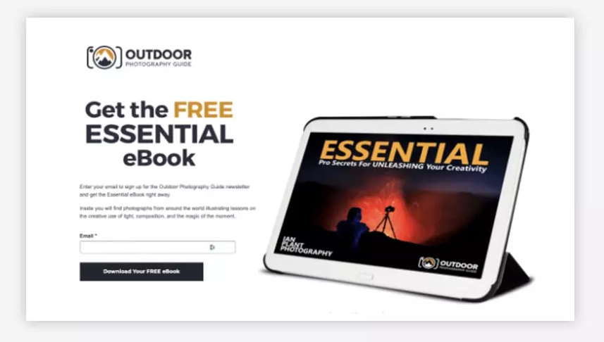
See this landing page? It was designed for the Essential e-book on the OPG or Outdoor Photography Guide, a community space with resources for wildlife and nature photographers.
The biggest thing that sets the landing page apart is the huge hero image. The visual is relatively cool and clear and gives us a true image of what is coming our way. That too, before you have read or checked out anything.
Key Takeaways
- Striking bold color and contrast – the colors used in depicting the book are very bright and exciting. The visuals almost show photographers that the book will be a great inspiration for them to be their creative selves, just like the landing page.
- USP is visible – Another powerful feature of the landing page is that the top features and benefits are visible clearly. They have specifically shown the e-book on the tablet, highlighting that they can use it on the device they like.
- Awesome hero image – as we talked about before, the hero image truly attracts you to the landing page. The silhouetted camera is an indication that the content is well-curated for photographers.
Check out their full landing page here
2. The ONE thing
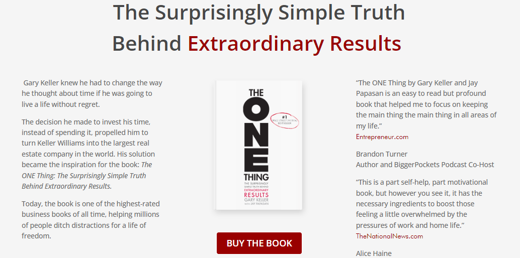
The book, The One Thing, by the writers Gary Keller and Jay Papasan, is one of the best sellers in the United States of America, and that is what they used as a USP on the landing page! As you go through the page, you realize it has a solid call to action coupled with top-notch reviews from some big names.
Key Takeaways
- Great call to action – with a clear 'Buy the Book' button just below the image of the book, visitors are enticed to make a purchase directly.
- Reviews and social proof – as you can see in the screenshot, the hero image is surrounded by the story behind the book and, secondly, by the hugely positive response received.
- Colors – the text placement and colors are soothing to the eyes and work well.
To dive into their website, head to [this link](
3. Living Forward
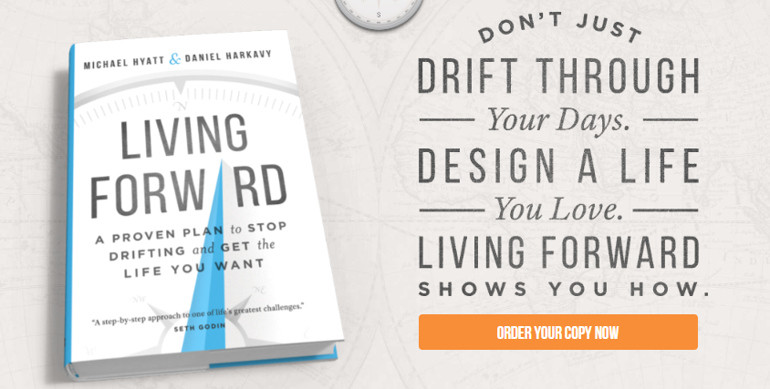
Michael Hyatt's Living Forward is a phenomenal book, but what's even better is the book landing page. You will observe a fantastic hero image, CTA, and an articulately written book description as you open the page. Nothing really can go wrong here.
Key Takeaways
Great book descriptions – needless to say, writing a captivating book description is bound to make sales on your book website. Potential customers must know what they are getting into. It is no less than a USP or a value proposition that you bring on to the table for an elevator pitch.
CTA – the call to action, 'Order your copy now,' is compelling enough to make that final buy.
4. The Manager’s Guide to Effective Feedback
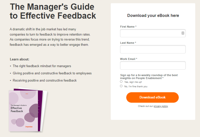
The landing page for The Manager's Guide to Effective Feedback is one of the simpler ones in the lot, but that doesn't lower its effectiveness. As they say, less is more!
Along with this fact, the page is truly functional too. It focuses on the essential part – the CTA.
Key Takeaways
Attention on the download from – here, the landing page informs you about the book without diverting you from eventually filling the download form. The organic CTA is as bright as it can get on a page made of lighter colors.
Simple and very relevant to the target audience – if you notice, the landing page has been curated for managers and senior-level positions who either care about what the book has or where they can make the purchase.
5. Greg McKeown’s Essentialism
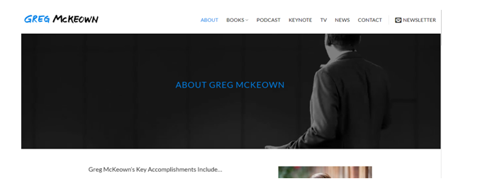
Key Takeaways
- Add the author's description – stronger and more relevant than you would have thought: people want to know more about the book writer they are investing their item in. An exciting bio can make you all excited to read the book.
6. An Accidental Awakening
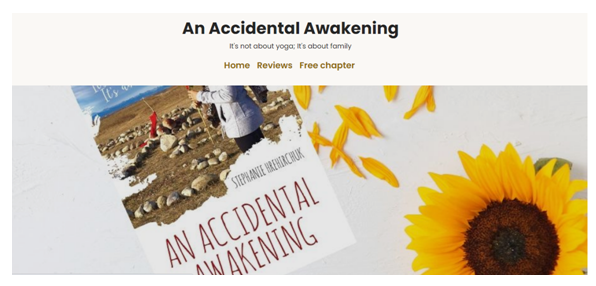
You know how they say, give them a taste and wait for them to come back for all of it? Well, that works excellently for the above-listed book,
An Accidental Awakening landing page. If you are sure of the book's quality, letting the potential buyers read the first chapter could be a great incentive.
Key Takeaways
Offer a look inside – giving a sneak peek into the book or the first page can help the readers be attracted to know more and thus, buy your book.
Author bio and signed copies – the landing page also has a lengthy description of the author and the thoughts that led to writing the book. This helps the buyers connect with the writer.
7. The Big Life
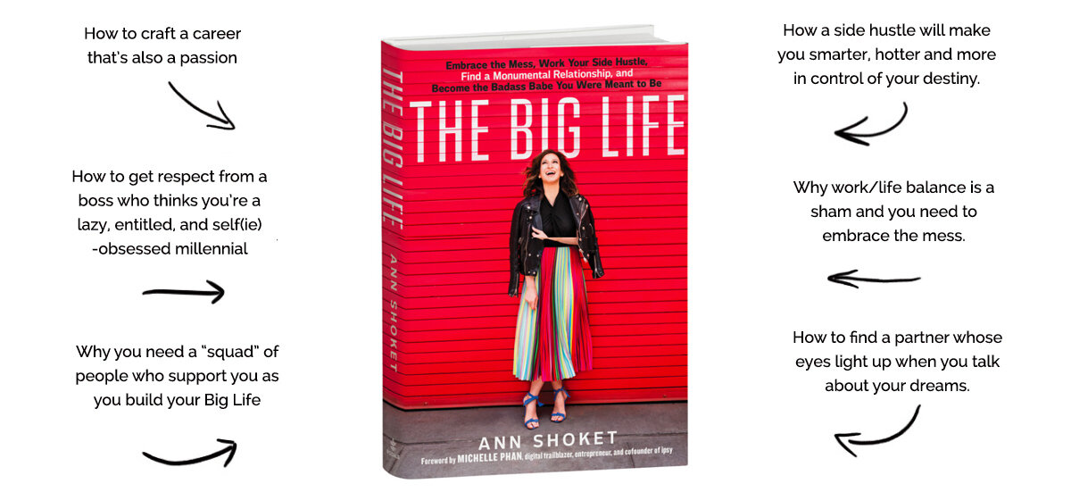
With Covid-19, there have been many changes in the industry of book marketing. The Big Life by Ann Shoket uses one of the best ways to entice readers in this post-pandemic world.
Key Takeaways
Nice and pleasing colors – the landing page has been created using the very same colors of the book with a clean background. The arrows give a more informal yet informative feel to the page.
Listen to the excerpt – like we discussed, allowing the readers to hear the words from the author themselves is one of the best crowd-pulling strategies.
Reviews – they have added some of the top reviews to inspire the readers.
8. 30-day Couple’s Devotional
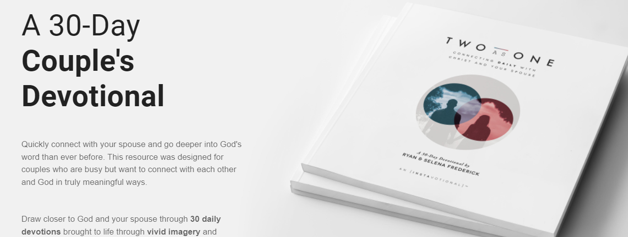
A book like A 30-day Couple's Devotional is a self-help book for couples and works as a fantastic guide. If you are launching a brand-new landing page for a book with a similar genre, do not forget to add FAQs and customer reviews just like they did. It gives an essence of a human touch to the book's values.
Key Takeaways
Customer reviews – A book written about a connection with a spouse that manages to bring in a change in the real-life couples is a winner. Clearly, that is what A 30-day Couples' Devotional does, and they don't forget to show it off.
FAQs – adding FAQs can involve the website visitors and quickly resolve their queries.
Solid CTA – the page has an appropriate call-to-action, allowing the reader to buy now or learn more.
9. The Lean Start-Up
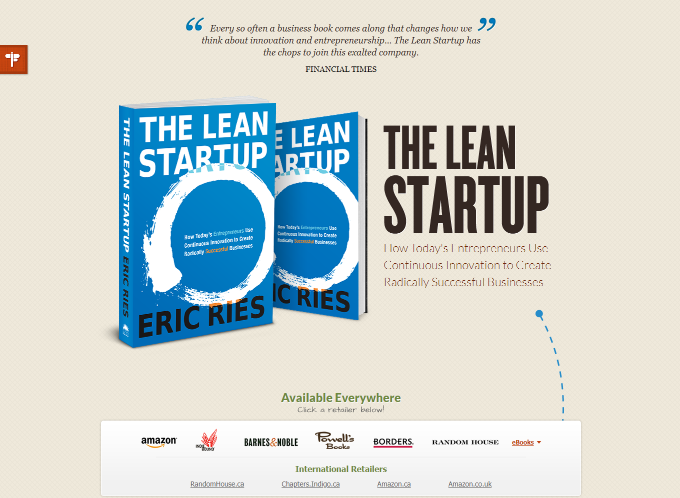
Sometimes, you need a dash of simplicity, and you are good! And that is what the landing page of The Lean Startup does, and boy does it ace the whole job.
Key takeaways
Minimalism – sometimes lighter shades of colors, less text, and images are the answer to attracting customers. Try to keep it clutter-free and straightforward without any unnecessary information.
Focus on CTA – the focus should be on selling the product and making sure the visitor makes a call from the page.
10. SAAS Optimization Guide by Unbounce
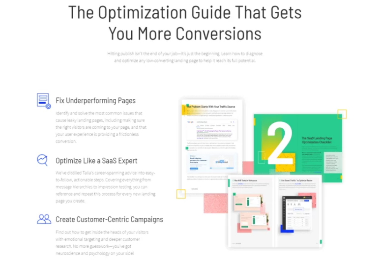
Most of the books on Amazon end up being sold due to the solid product descriptions. This is how landing pages work too. The image attached above is the landing page of the free SAAS optimization book by Unbounce that focuses on listing the ins and outs of the book to the website visitors.
Key Takeaways
USP – the most significant value proposition must be towards the top of the page; Once you tell the visitors the value that you bring onto the table, it will be tricky for them not to look into the offer.
Book description – your book bio should be as straightforward as possible. Visitors to the site must know what they’re getting into.
Best Landing Page Builder Software Tools

Unbounce
The first conversion platform, designed for small and midsize businesses.
It leads you to create high-quality content based on a big amount of tools such as great templates.
Here is a list of motivations why people choose this tool:
- Advanced features to create and convert amazing landing pages
- Huge quantity of possible integrations that are easy to develop
- Quick adjustment due to its simple interface, this way, non-designers will be pleased to use it
Starts from 90$/mo
Success stories:
Website: unbounce.com

Leadpages
Designed to allow business owners to post its services, websites and generate potential clients with trust
- Leadpages helps you to create and maintain your online business
- It allows you to generate virtual interactions and create your own personalizable fields, as well as statistics and informative analytics
- Highly recommended to all people interested in finding digital tools that can help you to build a great email list
You can start with 15$/mo
Success stories:
Website: leadpages.com

ConvertKit
ConvertKit is made for professional bloggers and creators.
They have a very strong landing page features and have good automation features.
They are a bit on the pricier side and their reporting/analytics features are just OK.
ConvertKit is best for: bloggers.
- 0-1k subscribers $29/month
- 1k-3k subscribers $49/month
- 3k-5k subscribers $79/month
- 5k+ subscribers $119/month
Success stories:
Website: convertkit.com
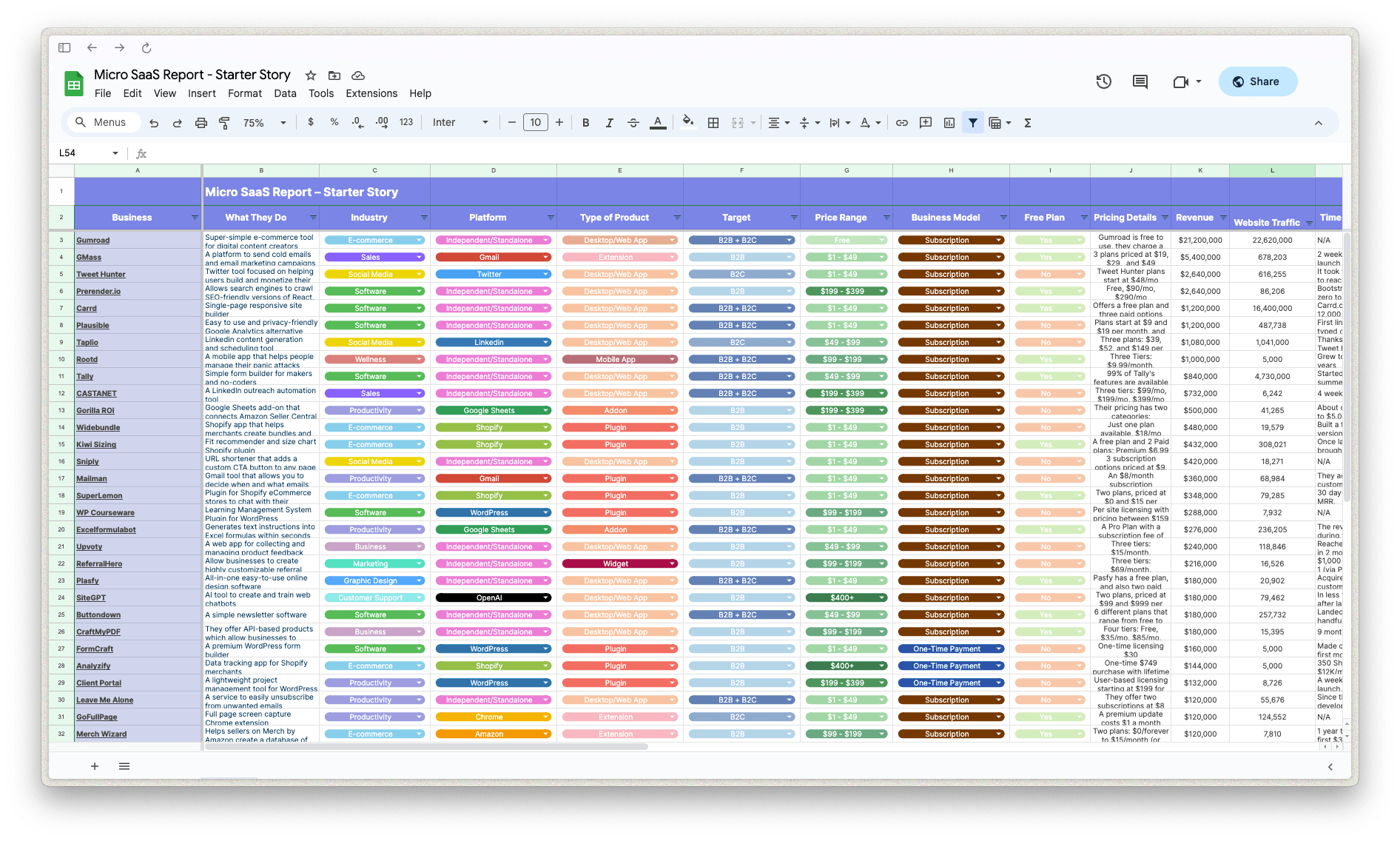
Download the report and join our email newsletter packed with business ideas and money-making opportunities, backed by real-life case studies.

Download the report and join our email newsletter packed with business ideas and money-making opportunities, backed by real-life case studies.

Download the report and join our email newsletter packed with business ideas and money-making opportunities, backed by real-life case studies.

Download the report and join our email newsletter packed with business ideas and money-making opportunities, backed by real-life case studies.

Download the report and join our email newsletter packed with business ideas and money-making opportunities, backed by real-life case studies.

Download the report and join our email newsletter packed with business ideas and money-making opportunities, backed by real-life case studies.

Download the report and join our email newsletter packed with business ideas and money-making opportunities, backed by real-life case studies.

Download the report and join our email newsletter packed with business ideas and money-making opportunities, backed by real-life case studies.
