12 Event Landing Page Examples That Convert Like Crazy [2024]
![12 Event Landing Page Examples That Convert Like Crazy [2024]](https://d1coqmn8qm80r4.cloudfront.net/stories/social_shares/000/072/683/original/open-uri20220516-4-6uhwkj?1652720297)
If you plan to run any kind of campaign, you can't get around landing pages.
One of the most important elements in conversion optimization is your landing page. It is the first impression you make on your new visitors and it will determine a lot of things; whether they buy your product, share it on social media or even come back.
But getting your landing page to look amazing and convert well can be a challenge.
In this article, we discuss what a landing page is and share some of the best landing page examples.
Here they are:
What Is A Landing Page?
A landing page is a web page that serves as the online destination for a marketing campaign — it's typically the final URL in a multi-touch sales process and delivers the desired response.
A landing page is usually associated with an offer, coupon or promotional campaign and is often linked to directly from an ad placed on another site. Other names for a landing page include: lead capture page, conversion page, opt-in page and squeeze page.
In simple terms:The purpose of a landing page is to successfully convert your website visitors into becoming leads and eventually customers.
That said, a good landing page is essential for any online marketing campaign.
What Should I Include In My Landing Page?
To start, it's important to understand who your audience is and what your desired goal is for your landing page.
Start by asking yourself these questions:
- What are the goals of my landing page?
- Who is my audience?
- Where do they live?
- How do they like to learn?
Once you figure out what your goals are and who your audience is, you can start thinking about how to create a great experience for them.
Here are some tips for creating the perfect landing page:
- Use a headline that is clear and to the point.
- Include a call-to-action (CTA) button that will lead visitors to other parts of your site or encourage them to subscribe to your newsletter or download an ebook.
- Use persuasive language that clearly describes what you want readers to do next (sign up for an account, download a free guide, etc.).
- Make sure that all links lead directly to where they need to go so visitors don’t get lost on your site before reaching their goal!
12 Examples Of Event Landing Pages
The following event landing pages are actual pages from real companies promoting their product or service.
1. Creative Cruise Event
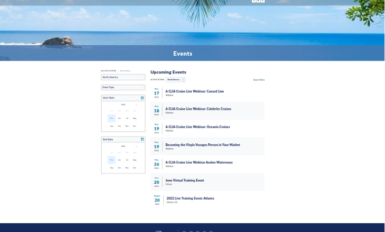
Creative Cruise Event is the best landing page, because it has been designed in such a way that it can be used for all types of events. If you want to promote your event, then this landing page will be best for you.
Key Features:
- Well designed: It has been designed with the help of experts and professionals. Therefore, if you are looking for some other kind of event landing page, then this is the right place for you.
- Highly Customizable: This landing page allows you to customize everything from the color scheme down to the fonts used throughout your site/landing page.
- Parallax scrolling effect: The parallax scrolling effect of this landing page will make your website look more attractive and engaging to your visitors. The built-in contact form will help you to collect leads from website visitors easily.
2. WPEngine Decode
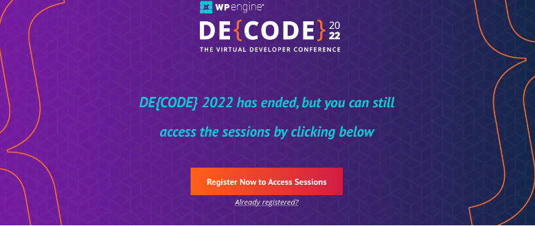
This landing page was created for WPEngine's Decode Dallas event. The page is designed to give potential attendees an overview of the event, and it also includes a call-to-action to register for the event.
Key Features
- Informative: The WPEngine Decode Dallas landing page is designed to be informative. It includes an overview of the event, as well as information on the speakers and the agenda.
- Secure and scalable: This landing page is also designed to be secure and scalable. WPEngine is a leading provider of WordPress hosting, and their landing pages reflect their commitment to security and scalability.
- Easy to use: The WPEngine Decode Dallas landing page is also easy to use. You can easily find information on the event, and you can register for the event with just a few clicks.
3. Dreamforce
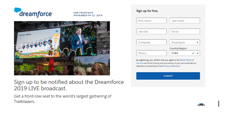
One of the world’s largest tech conferences, Dreamforce draws in big names and big crowds. But their landing page doesn’t look busy or intimidating. Instead, it’s clean and easy to navigate. Attendees can quickly find information on sessions, speakers, and scheduling.
Key Features
- Proof of concept: The Dreamforce event landing page is a great opportunity to introduce your company to the Salesforce market. It offers you a unique opportunity to reach a large audience of potential customers, partners and influencers.
- Great UX: Dreamforce provides visitors with an awesome online experience through an extensive online platform that includes thousands of webinars and hundreds of videos on demand and live streaming.
- Valuable insights: The Dreamforce landing page is a great example of how to provide a lot of information without making it feel overwhelming. By breaking down the different sections of the page, potential attendees can easily find what they're looking for.
4. TechCon
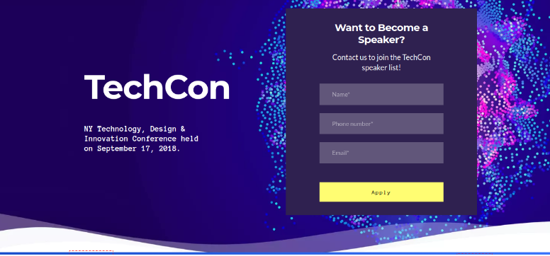
TechCon is an annual conference that brings together the best and brightest minds in technology. Their landing page is simple but effective, with a clear call-to-action and easy-to-find information on sessions and speakers.
Key Features
- Clear and simple: The design uses large images that allow you quick access of important information like registration, speakers or schedule without having too much extra stuff on your screen at one time making things less cluttered for visitors
- Easy to navigate: It has a professional look that can help you to impress your clients. The design and layout are user-friendly and easy to navigate through.
- Mobile friendly: Our event landing page is mobile friendly which means it can be viewed on any device without any problems. This feature makes it easier for visitors to view your content even if they are on their mobile phones or tablets.
5. EventBrite
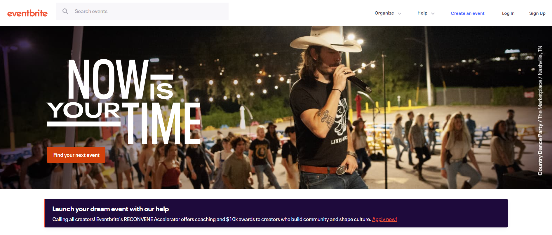
EventBrite is a popular event planning platform, and their landing pages reflect its user-friendly approach. The pages are simple and straightforward, with clear calls-to-action and easy-to-find information on sessions and speakers.
Key Features
- Showcases most important details EventBrite landing pages are all about the event. The page is designed to showcase all the important information about the event, including the date, time, location, and description.
- Incentivizes user to share on social: EventBrite makes it easy to promote your event with their landing pages. The pages are designed to be shared on social media, and they offer a variety of tools to help you get the word out about your event.
- Easy registration: EventBrite has an easy and intuitive registration process. The registration process is quick and easy, and you can even use EventBrite to sell tickets to your event.
6. Crimons Event Decoration Agency
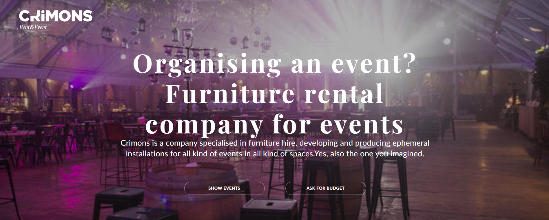
Crimons is an event decoration agency, and their landing pages reflect their creative approach to event planning. The pages are colorful and visually-appealing, with clear calls-to-action and easy-to-find information on services and pricing.
Key Features
- Visually appealing: Crimons makes a great first impression with their visually-appealing landing pages. The pages are designed to stand out, and they do a great job of showcasing the company’s creative approach to event planning.
- Shows customer work and testimonials: Crimons’ landing pages also showcase the company’s work, with photos and videos of their past events. This is a great way to show potential clients what you’re capable of, and it can help you to stand out from the competition.
- Clear contact us page: Crimons makes it easy for potential clients to get in touch with their clear contact information and form. They also offer a free consultation, so potential clients can learn more about their services.
7. Artist Project Contemporary Art Fair
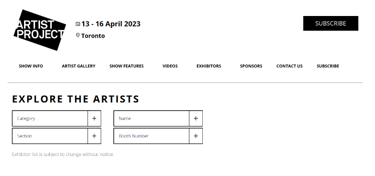
Artist Project Contemporary Art Fair is one of the most important event landing pages in the art market, especially for artists, collectors, dealers and galleries. It is known to create a platform for artistic expression and provide a space for international artists to exhibit their artworks
Key Features
- Showcases contemporary art: This landing page showcases contemporary art by emerging international artists from all over the world who exhibit their work for public viewing and purchase by collectors and enthusiasts alike.
- A wide range of styles: At this landing page, You'll see everything from abstract paintings to digital prints at this event. It's easy for everyone to find something that appeals to their interests because there's so much variety!
- Easy to navigate: The Artist Project Contemporary Art Fair landing page is easy to navigate. You can quickly find information on the event, and you can buy tickets with just a few clicks.
8. MAU by Grow.co
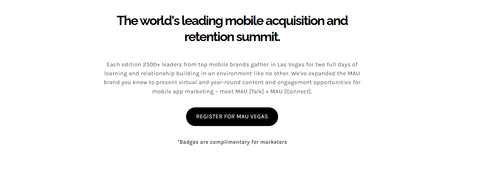
The MAU by Grow.co landing page is a great example of how to use an elitist approach in your marketing strategy - you can't just purchase tickets, but need apply first as they are only available for service providers and app marketers.
Key Features
- Modern and clean design: The MAU by Grow.co landing page has a modern and clean design. It includes a sleek registration form, and the call-to-action is easy to find.
- Extremely easy to customize: This landing page is also designed to be extremely easy to customize. You can easily add your own branding, and you can even change the color scheme of the page.
- Fits any screen size: The MAU by Grow.co landing page is also designed to fit any screen size. This means that it will look great on mobile devices, and it will also scale up to large monitors.
9. Affiliate World Asia
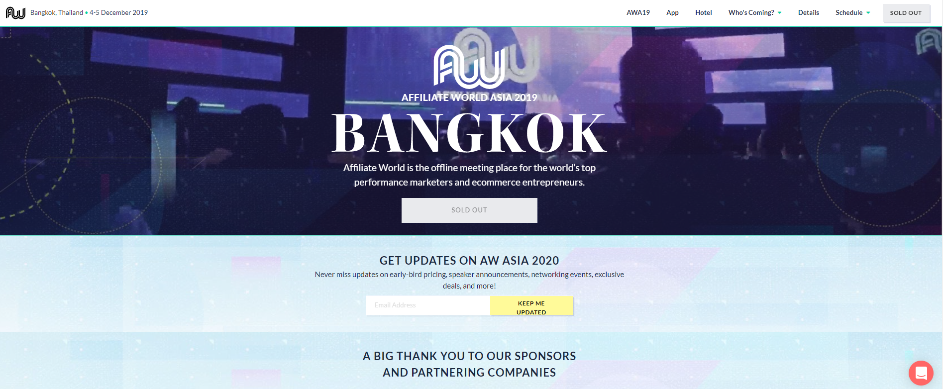
The Affiliate World Asia landing page was created for an event that is designed to help affiliate marketers learn about the latest trends and strategies. It includes all the information about what's happening in the event and how to register for it!
Key Features
- Up-to-date information: The Affiliate World Asia landing page is designed to be up-to-date. It includes the latest information on the event, as well as a call-to-action that is easy to find.
- Designed for affiliates: This landing page is also designed for affiliate marketers. It includes a sleek registration form, and it also has a section for affiliates to sign up for the event.
- Huge networking event: This event is not just another conference or seminar. It's a huge networking event where you can meet fellow marketers, share ideas with industry experts and make new friends that will change your life.
10. FraudBuzz
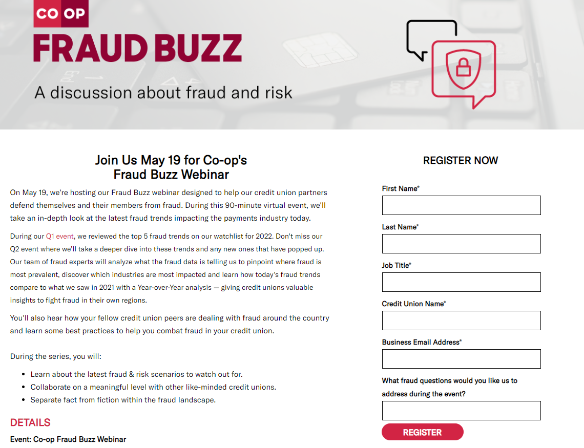
FraudBuzz landing page is especially designed for events which makes it easy for users to find out about the event. This landing page has been designed with the highest level of attention to detail, usability and conversion optimization.
Key Features
- Provides relevant information: FraudBuzz provides potential attendees with all the information they need to know about the event, including speakers, sessions, and pricing.
- Easy registration: FraudBuzz makes it easy to register for the event with a clear call-to-action and an easy-to-use registration form. It’s also worth noting that the page is mobile-friendly, so potential attendees can register on the go.
- Includes various features: Fraudbuzz is the ultimate event landing page for every type of event. It comes with a complete set of features that will allow you to manage your events like a pro.
11. Red Hat Summit
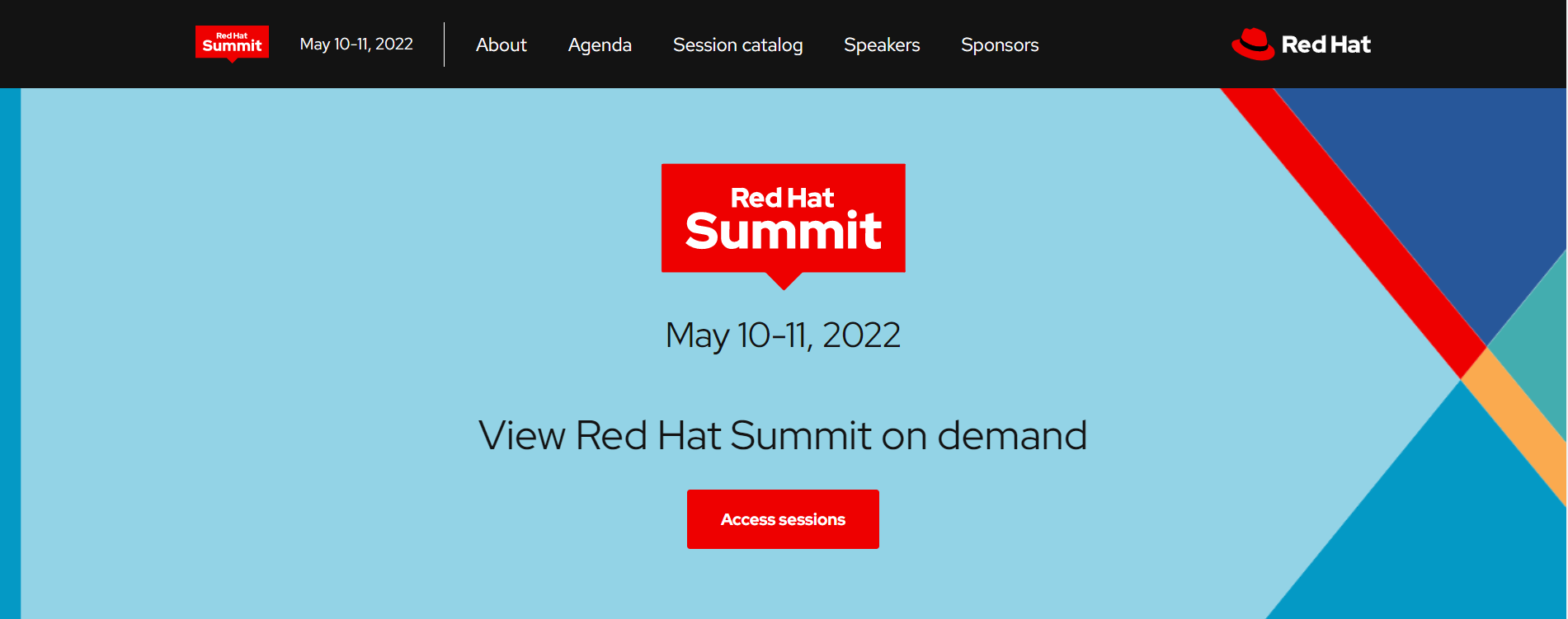
Red Hat Summit is an annual conference for enterprise open source professionals. This landing page is a perfect platform for startups to showcase their products and services in front of thousands of participants who are ready to invest in new technologies.
Key Features
- Networking opportunities: The conference provides attendees with ample networking opportunities, including a Meet the Experts session and an Open Source collaboration station.
- Open source community: The conference is a great opportunity to meet people from the open source community and learn about new projects. This can be beneficial for attendees who are looking to learn more or get involved in open source projects.
- Learn from the experts: The conference features a variety of expert speakers from Red Hat and other companies. This is a great way to learn about new technologies and trends from the people who are driving these changes.
12. Confab Event
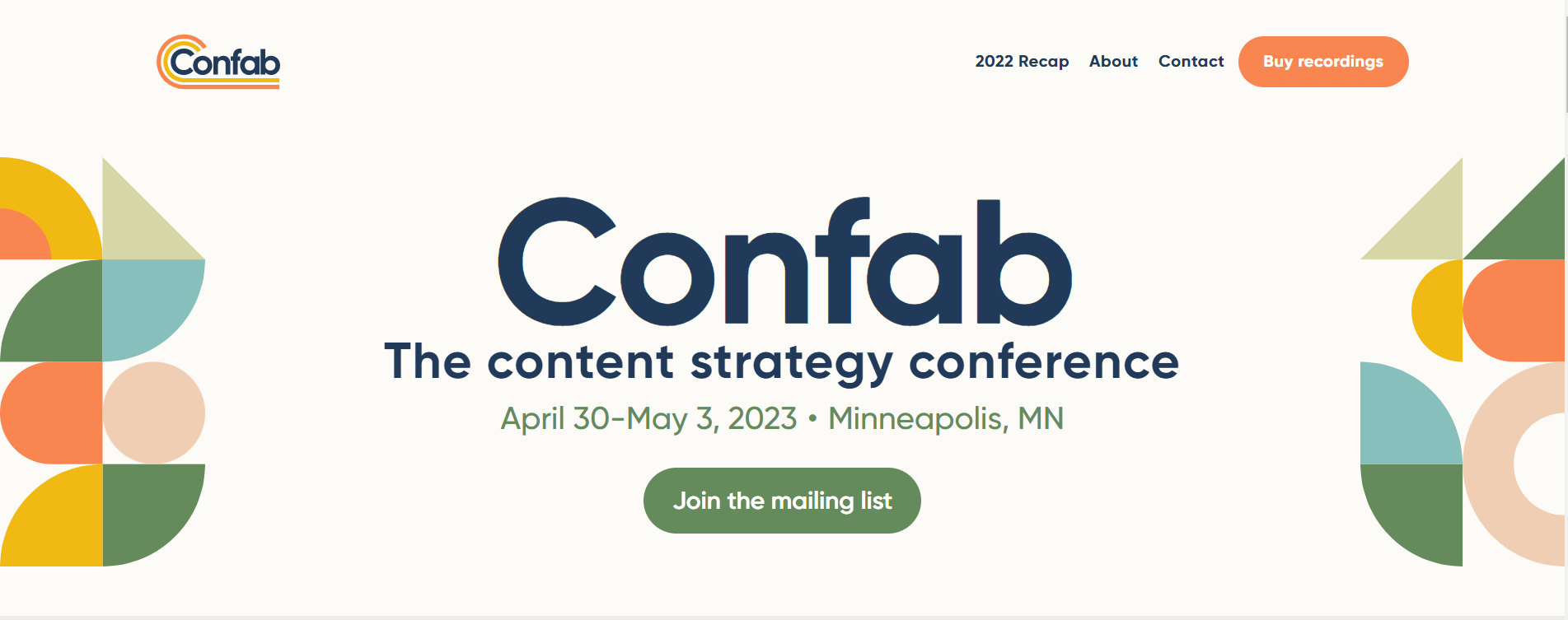
Confab Event landing page is perfect to promote your event and get more people to it. The page is designed to be clean and easy to navigate with all the important information about your event that potential attendees would want to know.
Key Features
- Event information: This landing page is designed to help you promote your event and get more people interested in attending. It includes all the important information about your event, such as date, time, location, and speakers.
- Social media: The website also includes social media buttons so potential attendees can share the event with their friends and followers.
- Easy registration: The registration process is simple and only takes a few minutes. Once registered, attendees will receive an email with all the important information about the event.
Best Landing Page Builder Software Tools

Unbounce
The first conversion platform, designed for small and midsize businesses.
It leads you to create high-quality content based on a big amount of tools such as great templates.
Here is a list of motivations why people choose this tool:
- Advanced features to create and convert amazing landing pages
- Huge quantity of possible integrations that are easy to develop
- Quick adjustment due to its simple interface, this way, non-designers will be pleased to use it
Starts from 90$/mo
Success stories:
Website: unbounce.com

Leadpages
Designed to allow business owners to post its services, websites and generate potential clients with trust
- Leadpages helps you to create and maintain your online business
- It allows you to generate virtual interactions and create your own personalizable fields, as well as statistics and informative analytics
- Highly recommended to all people interested in finding digital tools that can help you to build a great email list
You can start with 15$/mo
Success stories:
Website: leadpages.com

ConvertKit
ConvertKit is made for professional bloggers and creators.
They have a very strong landing page features and have good automation features.
They are a bit on the pricier side and their reporting/analytics features are just OK.
ConvertKit is best for: bloggers.
- 0-1k subscribers $29/month
- 1k-3k subscribers $49/month
- 3k-5k subscribers $79/month
- 5k+ subscribers $119/month
Success stories:
Website: convertkit.com
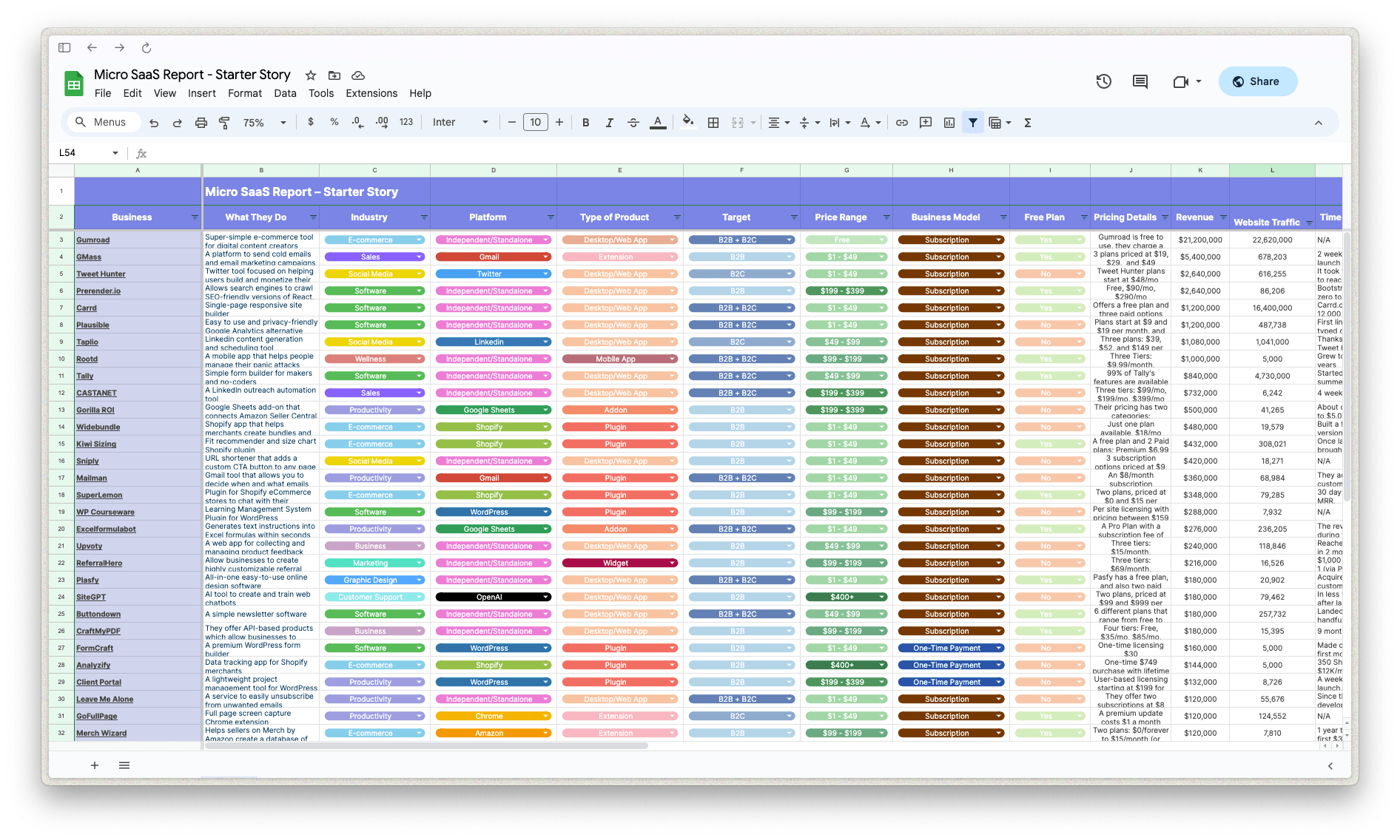
Download the report and join our email newsletter packed with business ideas and money-making opportunities, backed by real-life case studies.

Download the report and join our email newsletter packed with business ideas and money-making opportunities, backed by real-life case studies.

Download the report and join our email newsletter packed with business ideas and money-making opportunities, backed by real-life case studies.

Download the report and join our email newsletter packed with business ideas and money-making opportunities, backed by real-life case studies.

Download the report and join our email newsletter packed with business ideas and money-making opportunities, backed by real-life case studies.

Download the report and join our email newsletter packed with business ideas and money-making opportunities, backed by real-life case studies.

Download the report and join our email newsletter packed with business ideas and money-making opportunities, backed by real-life case studies.

Download the report and join our email newsletter packed with business ideas and money-making opportunities, backed by real-life case studies.
