15 Real Estate Landing Page Examples Guaranteed To Convert [2024]
![15 Real Estate Landing Page Examples Guaranteed To Convert [2024]](https://d1coqmn8qm80r4.cloudfront.net/stories/social_shares/000/072/680/original/open-uri20220505-4-13f8pxx?1651792451)
If you plan to run any kind of campaign, you can't get around landing pages.
One of the most important elements in conversion optimization is your landing page. It is the very first impression you make on your new visitors and it will determine a lot of things; whether they buy your product, share it on social media or even come back.
But getting your landing page to look amazing and convert well can be a challenge.
In this article, we discuss what a landing page is and share some of the best landing page examples.
What Is A Real Estate Landing Page?
A landing page is a web page that serves as the online destination for a marketing campaign — it's typically the final URL in a multi-touch sales process and delivers the desired response.
A real estate landing page is usually associated with an offer, coupon or promotional campaign and is often linked to directly from an ad placed on another site. Other names for a landing page include: lead capture page, conversion page, opt-in page and squeeze page.
In simple terms: The purpose of a landing page is to successfully convert your website visitors into becoming leads and eventually customers.
That said, a good landing page is essential for any online marketing campaign.
What Should I Include In My Real Estate Landing Page?
To start, it's important to understand who your audience is and what your desired goal is for your landing page.
Start by asking yourself these questions:
- What are the goals of my landing page?
- Who is my audience?
- Where do they live?
- How do they like to learn?
Once you figure out what your goals are and who your audience is, you can start thinking about how to create a great experience for them.
Here are some tips for creating the perfect landing page:
- Use a headline that is clear and to the point.
- Include a call-to-action (CTA) button that will lead visitors to other parts of your site or encourage them to subscribe to your newsletter or download an ebook.
- Use persuasive language that clearly describes what you want readers to do next (sign up for an account, download a free guide, etc.).
- Make sure that all links lead directly to where they need to go so visitors don’t get lost on your site before reaching their goal!
15 Examples Of Real Estate Landing Pages
The following landing pages are actual pages from real companies promoting their real estate services.
1. Redfin
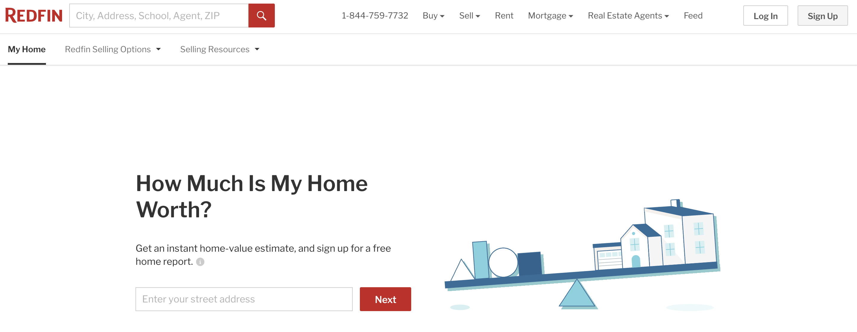
Redfin's landing page has an excellent design, good navigation, and a compelling call to action.
Immediately, as you enter their site, you are hit with an engaging question that entices you to fill out specific information.
Key Takeaways
- Clear Call To Action: It has a clear call-to-action that will lead directly to the next step in your conversion funnel — in this case, getting an instant quote on your home.
- Customer Trust: The site doesn't try to sell you anything on its homepage. Instead, it shows you what Redfin offers and how it can help you find your dream home.
- Easy navigation: The main goal of any website should be to provide information about products or services as quickly as possible. Redfin does this by making sure that every section on their site has clear navigation options that lead back to the homepage.
2. HomeLight
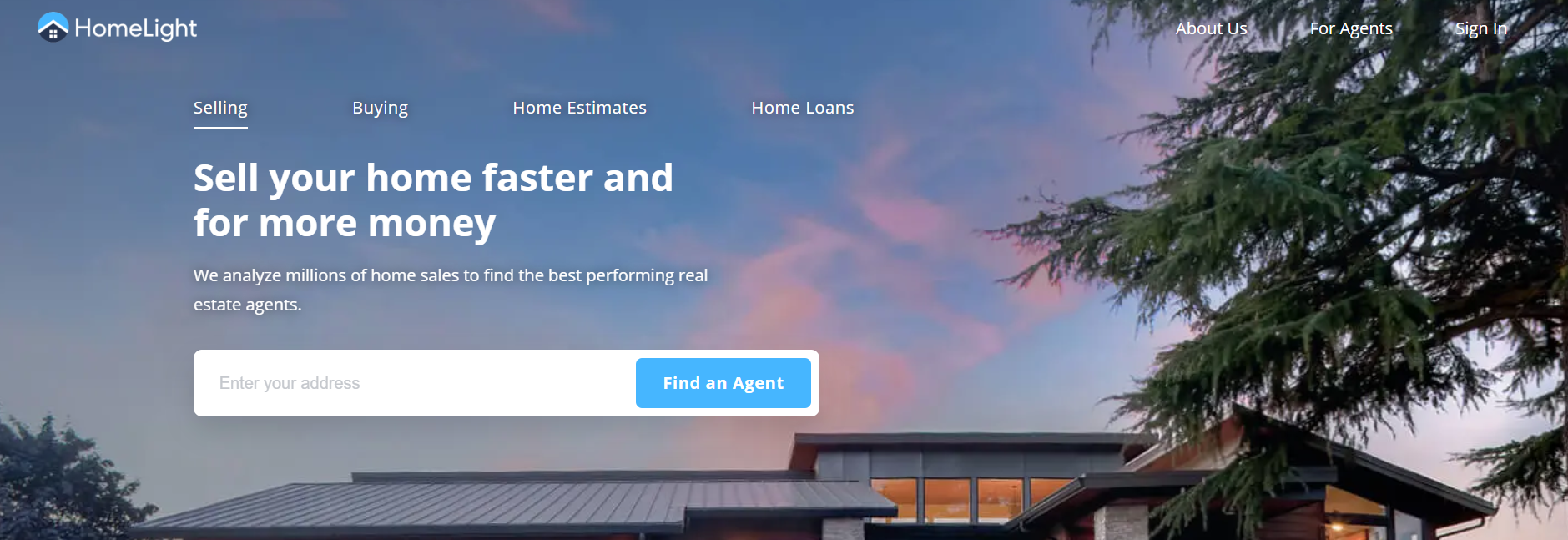
HomeLight 's landing page is clean and simple, with just a few key pieces of information that are relevant to their audience. The use of bright colors and images makes the page visually appealing, without being overwhelming.
Key Takeaways
Clearly-labeled sections: Each section of the page has an obvious heading that describes its purpose. So there’s no confusion about where you should click next. This makes it easy for visitors to find what they need quickly.
Includes a clear CTA: The CTA at the bottom of the page is big enough and bright enough that it stands out from everything else on the page, making it impossible not to notice when you scroll down halfway through your visit.
Offer homebuyer’s workshop: The landing page does a good job of telling you what the workshop is all about — how to get started with your first home, whether you are buying or renting, how to make the most of your money and more.
3. Flyhomes
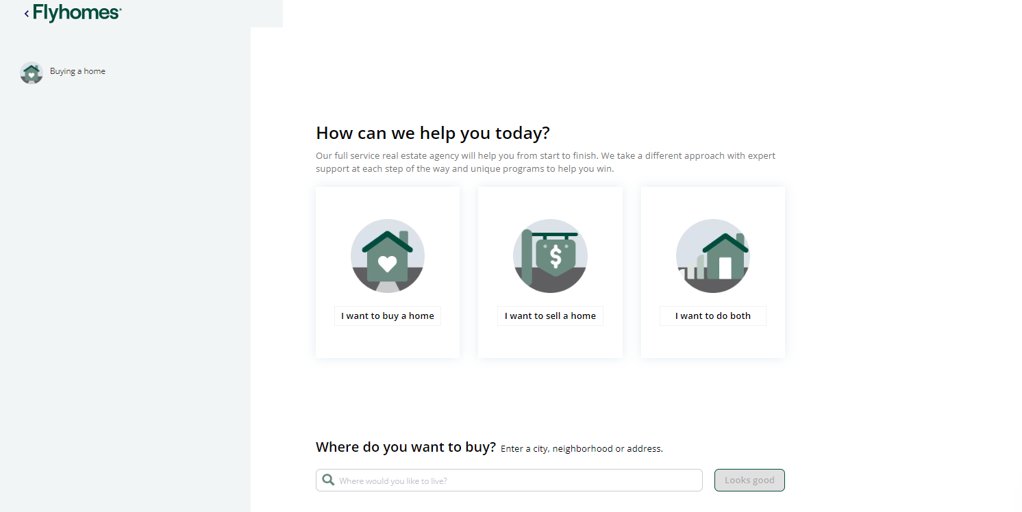
Flyhomes has an incredible landing page that’s perfect for real estate agents who want to promote their listings online. The creation of this landing page does something different. It combines design and content, providing potential customers with useful information.
Key Takeaways
Social media integration: It integrates well with social media platforms like Facebook and Twitter so buyers can easily share their favorite properties with friends and family members.
Useful content: The page has a clean layout with a bold headline and some text below it. It shows the variety of options available on the site, which is important for potential users who are looking for a place to live.
Great headline: The headline is bold and eye-catching, and you can see how they're using negative space to make sure your attention goes straight to the CTA.
4. Realtor
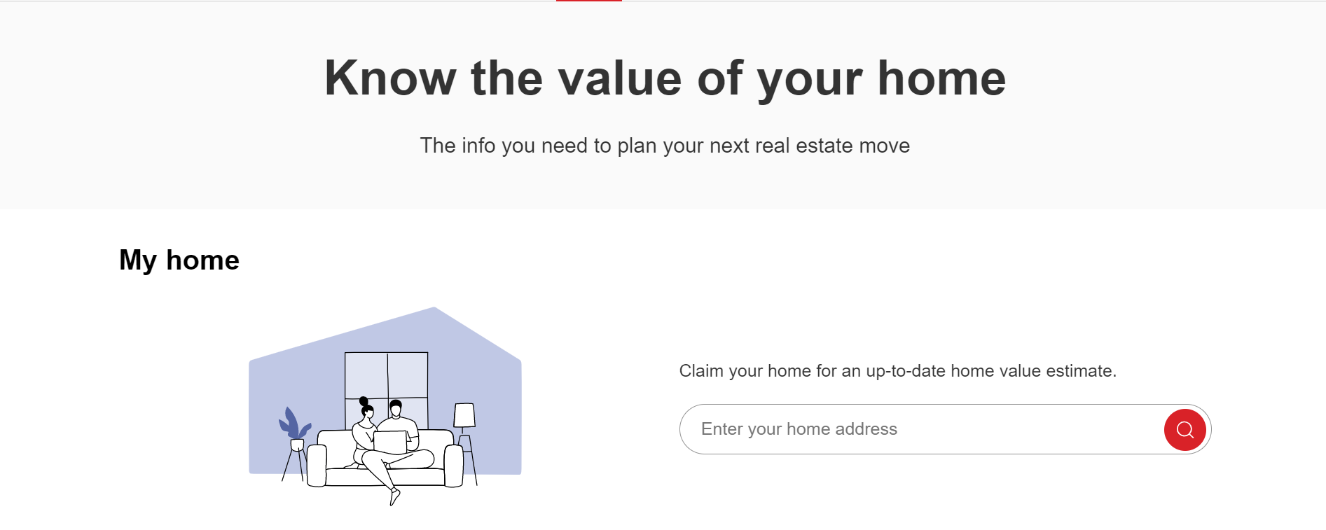
Realtor’s landing page helps in attracting more visitors who come looking for specific information about homes for sale or rent in their area. This page provides a brief overview of what Realtor does and how it can help people find homes for sale in their area.
Key Takeaways
Clear and simple: Realtor's landing page is very simple, but effective. There isn't a lot of clutter or distractions on the page, which makes it easier for visitors to learn more about the real estate.
Uses video: The realtor's landing page uses a video in combination with text and an image to explain why you should use their service. The video shows people listing their homes with the realtor and provides testimonials from satisfied customers.
Clear Communication: Realtors are professionals at communicating clearly and effectively with potential clients and sellers, which makes their landing pages easy to understand even for those who aren't familiar with the real estate business.
5. Streeteasy
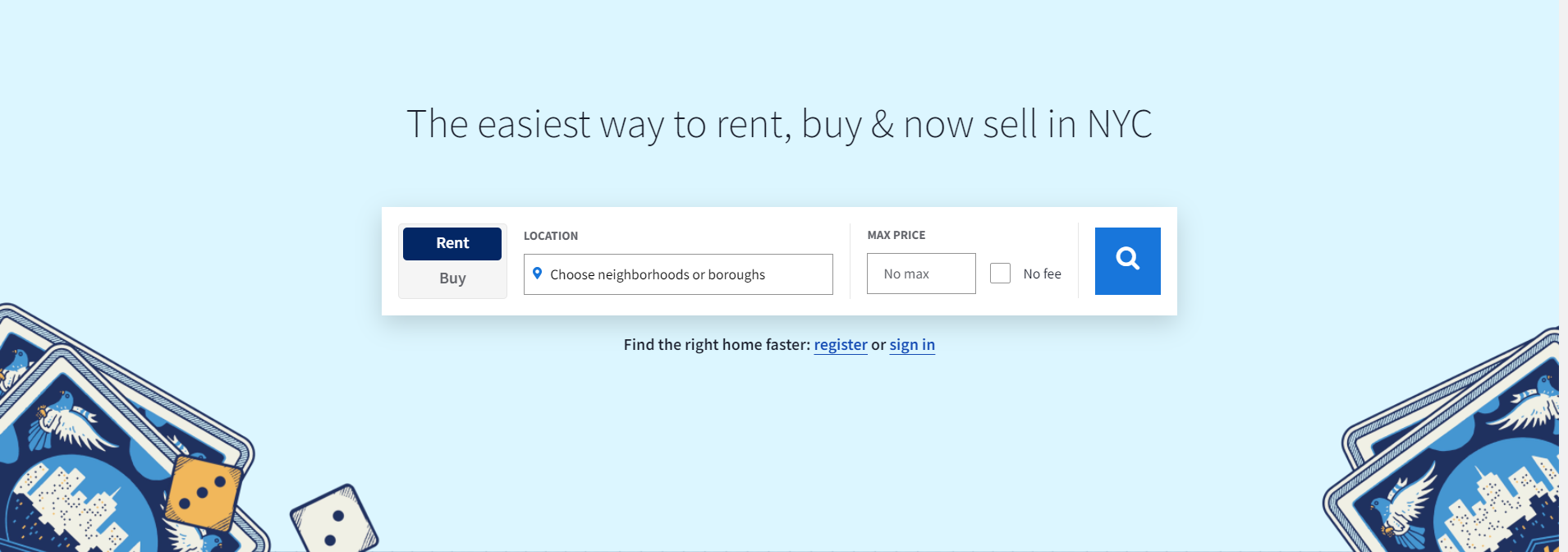
Streeteasy is a leading real estate search engine that provides both renters and home buyers with information about properties for sale or rent in hundreds of neighborhoods across the United States.
Key Takeaways
Clear call-to-action: The call-to-action on Streeteasy's landing page is clear, simple and easy to understand. The call-to-action also uses a friendly word like "Find" instead of an impersonal word like "Go."
Short form length:The form itself isn't long at all — just two fields and an email address field, which should be enough for anyone who wants to subscribe to their newsletter.
Customer Testimonials: StreetEasy also uses some social proof with testimonials from happy customers who used their service to find an apartment. It shows potential customers that other people have had great experiences with StreetEasy.
6. Vintage Oaks
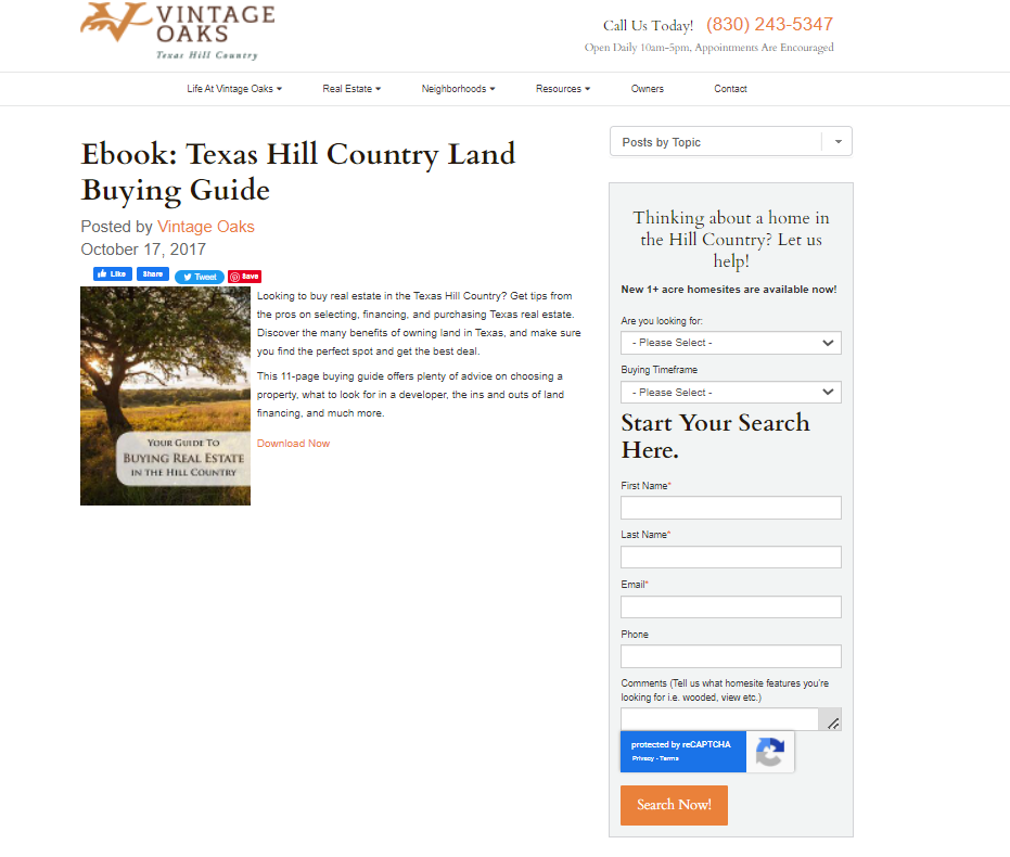
Vintage Oaks is one of the most popular landing pages that Convertify has ever tested. This page is well-built, with a lot of information about the product, along with a demo video that shows you how to easily customize each theme
Key Takeaways
Offers a free ebook: The Vintage Oaks offers a free ebook, just for contact information. The e book has some really great ideas on how to make your house more homey and personal!
Easy to use: There are so many different features available through the app, but they're all organized in such a way that makes them easy for anyone to navigate through without having any problems whatsoever with finding what they need when they need it.
Community Tour: This page provides guided tours of the property. These are very helpful if you want to get a sense of how Vintage Oaks looks and feels before making a commitment.
7. TurnKey
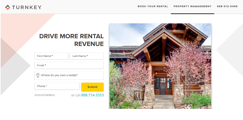
The turnkey landing page is a vacation rental platform. It provides a single path forward for interested leads, making the process of marketing your company easy and streamlined.
Key Takeaways
Collect new leads: It allows you to create an unlimited number of landing pages for free. You don't even need to register or sign-up for anything! With just a few clicks you can create a new landing page and start collecting leads.
Meet the Goals: It knows what its goal is and it meets that goal in an effective way by providing users with solutions to their problems.
customize your sales: Turnkey also makes it easy for you to create and customize your own sales funnel by adding additional opt-in forms, lead capture pages, and upsells.
8. Opendoor
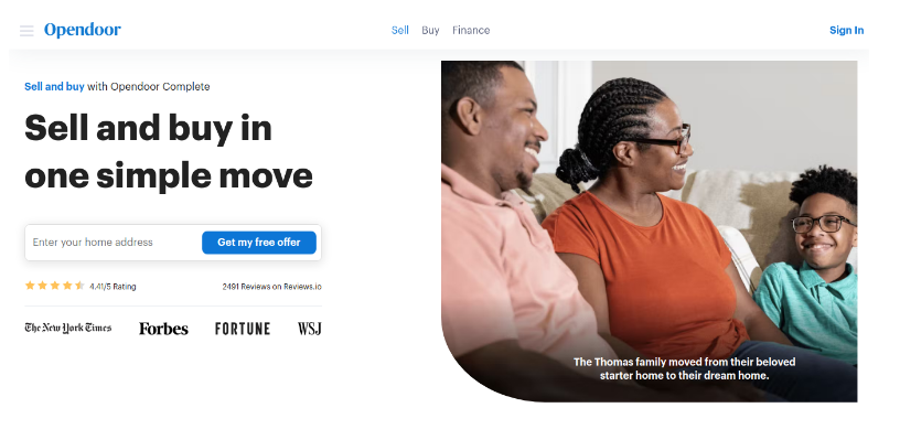
Opendoor has the perfect landing page for your next real estate sale. It's intuitive, attractive and easy to use which will increase conversions by providing an experience that shoppers want!
Key Takeaways
Simple and clean: The Opendoor landing page doesn’t have any unnecessary clutter or distractions. It’s got just the right amount of information that you need to understand what the company does and how it works, along with some key benefits.
Use bullets: This landing page uses bullets to highlight the different ways users can save money by listing their home with Opendoor.
Straightforward and easy: This page is straightforward and easy to read because it uses simple sentences and short paragraphs. There are no long paragraphs or sentences that are difficult to read; instead, each sentence has just one idea or thought in it.
9. Sundae
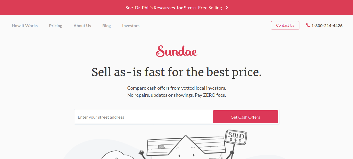
Sundae is a great resource for sellers who are in tough spots. They can find helpful tips and tricks to make their lives easier. Sundae 's landing page is focused on their unique selling proposition- helping home sellers save time and money.
Key Takeaways
Free & easy: You don’t need any special skills or knowledge to use Sundae. Just sign up for free, log in, upload your content and publish your first landing page in less than a minute!
They're mobile friendly: The landing page is fully responsive,everything on these pages works just as well on a smartphone as it does on a desktop computer or tablet.
Eye catching design: The landing page has a clean design with an attractive color scheme which makes it very appealing to visitors. The colors used also match the theme of your website or app, making them look more appealing for users visiting your site for the first time.
10. Up2Date Real Estate
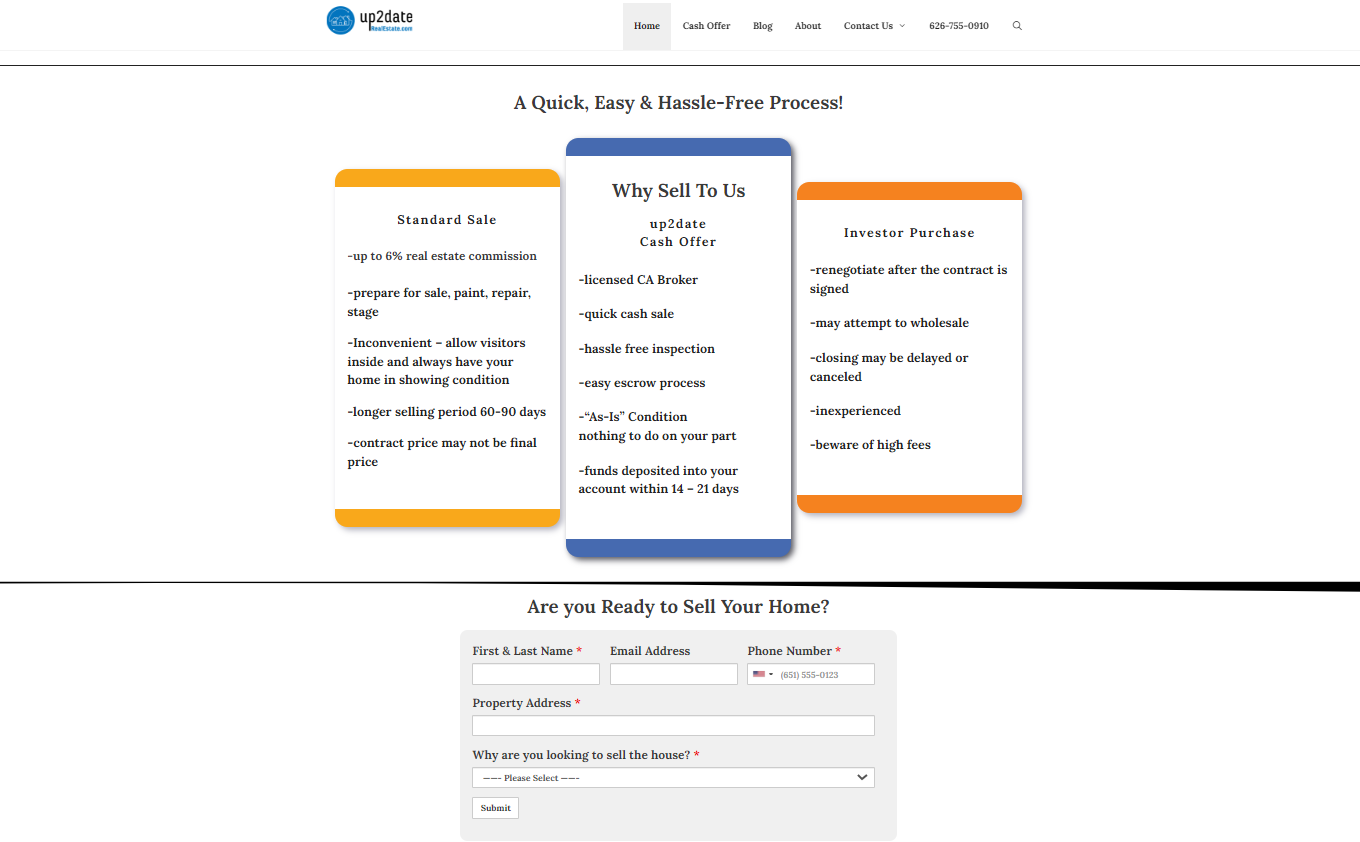
The Up2Date Real Estate landing page is designed to boost conversions by using the right combination of design and copywriting elements such as headlines, subheads, bullets and images.
Key Takeaways
Beautiful and attractive design: They have designed this landing page very beautifully with attractive colors and graphics, which catches the attention of visitors easily and makes them click on any call-to-action button like “Buy” or “Sell” buttons etc.
Offers many services: Up2Date offers services such as mortgage loans, home improvement loans, personal loans and credit cards as well as insurance policies for your home or car. The company also offers tips on how to get rid of debt or save money
Can be used for various purposes: You can use Up2Date Real Estate as a landing page to build trust with potential clients, educate them on the services you offer, and direct them to your website or blog where they can learn more about your company.
11. Keri Shull
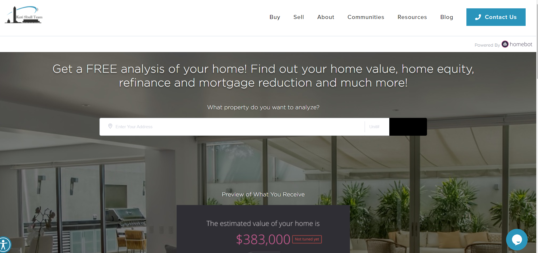
This landing page is designed to capture leads by offering a free home-buying guide. It's where you convert visitors into leads and leads into sales.
Key Takeaways
Designs pages for mobile devices: This page has been designed to be mobile-friendly. The pages are easy to navigate on a small screen and the team has made sure that all the important information is still readily available.
Lead capture forms are prominently displayed: Another great feature of this site is that the lead capture forms are prominently displayed. There are two forms on the homepage — one for people who are interested in buying a home and one for those who are interested in selling.
Offers a free guide: This landing page offers a free guide that promises to help people understand the home-buying process. This is an excellent way to capture leads from people who are interested in buying a home but may not be ready to commit to working with a real estate agent.
12. Elliman

Douglas Elliman is one of the largest real estate companies in the United States. The company's landing page is designed to capture leads by offering a free market report.
Key Takeaways
Has a clean and simple design: The first thing that you'll notice about this site is that it has a clean and simple design. There is a lot of white space and the important elements are all easy to find.
The call-to-action is prominent: The call-to-action on this page is very prominent. It's above the fold and it's hard to miss.
Offers a free market report: One of the things that we really like about this site is that it offers a free market report. This is an excellent way to capture leads from people who are interested in learning more about the real estate market.
13. YHM Property Solutions
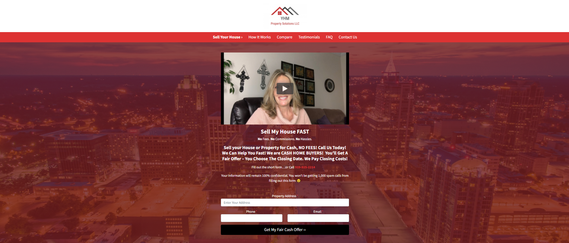
YHM Property Solutions is a real estate company that specializes in helping people buy and sell homes. The company's landing page is designed to capture leads by offering a free home-buying guide.
Key Takeaways
Uses a video background: One of the things that we really like about this site is that it uses a video background. The video is an excellent way to capture people's attention and it helps to set the company apart from its competitors.
The call-to-action is clear: The call-to-action on this page is very clear. You can see it as soon as you arrive on the site and it's easy to understand.
Social Media Integration: Another thing is that this site has social media integration. This is a great way to build trust with potential leads by showing them that you're active on social media.
14. Quick Move Now
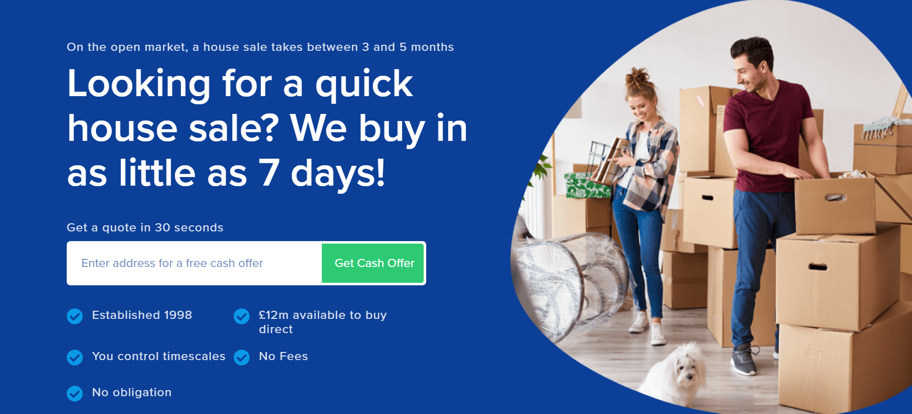
Quick Move Now is a real estate landing page designed to convert more of your website visitors into leads. It offers a variety of real estate lead capture and conversion templates, so you can create the right message for any type of buyer.
Key Takeaways
Offers a free valuation: One of the things that we really like about this site is that it offers a free valuation. This is an excellent way to capture leads from people who are interested in selling their home but may not be sure of its value.
Clear and concise: This page is very clear and concise. It's easy to understand what the company does and how it can help you.
Built with SEO in mind : Another great thing about this site is that it has been built with SEO in mind. This is evident in the title and meta tags, which are designed to help the site rank highly in search engines.
15. Agent Home Values
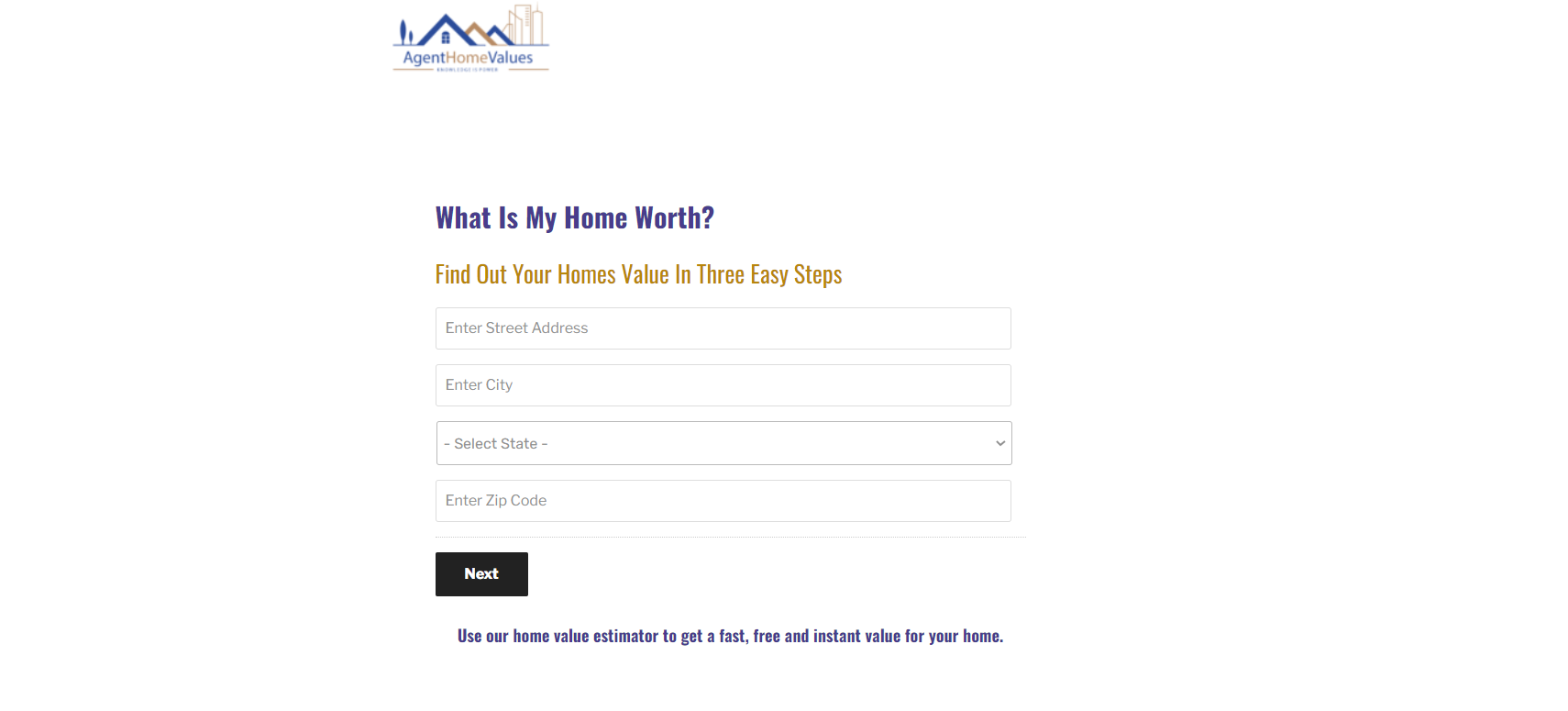
This estate landing page has been designed to give you the best results in terms of increasing conversion rates and more sales. The real estate landing page comes with a clean design and will help you get more leads from your website traffic.
Key Takeaways
High conversion rate: This real estate landing page has been designed to increase your conversion rate. The clean design and effective call-to-action will help you get more leads from your website traffic.
More sales: This estate landing page will also help you increase your sales. The clean design and effective call-to-action will help you close more deals and increase your sales.
Best results: This real estate landing page will give you the best results in terms of increasing conversion rates and more sales. The clean design and effective call-to-action will help you get more leads from your website traffic and close more deals.
Best Landing Page Builder Software Tools

Unbounce
The first conversion platform, designed for small and midsize businesses.
It leads you to create high-quality content based on a big amount of tools such as great templates.
Here is a list of motivations why people choose this tool:
- Advanced features to create and convert amazing landing pages
- Huge quantity of possible integrations that are easy to develop
- Quick adjustment due to its simple interface, this way, non-designers will be pleased to use it
Starts from 90$/mo
Success stories:
Website: unbounce.com

Leadpages
Designed to allow business owners to post its services, websites and generate potential clients with trust
- Leadpages helps you to create and maintain your online business
- It allows you to generate virtual interactions and create your own personalizable fields, as well as statistics and informative analytics
- Highly recommended to all people interested in finding digital tools that can help you to build a great email list
You can start with 15$/mo
Success stories:
Website: leadpages.com

ConvertKit
ConvertKit is made for professional bloggers and creators.
They have a very strong landing page features and have good automation features.
They are a bit on the pricier side and their reporting/analytics features are just OK.
ConvertKit is best for: bloggers.
- 0-1k subscribers $29/month
- 1k-3k subscribers $49/month
- 3k-5k subscribers $79/month
- 5k+ subscribers $119/month
Success stories:
Website: convertkit.com
Download the report and join our email newsletter packed with business ideas and money-making opportunities, backed by real-life case studies.

Download the report and join our email newsletter packed with business ideas and money-making opportunities, backed by real-life case studies.

Download the report and join our email newsletter packed with business ideas and money-making opportunities, backed by real-life case studies.

Download the report and join our email newsletter packed with business ideas and money-making opportunities, backed by real-life case studies.

Download the report and join our email newsletter packed with business ideas and money-making opportunities, backed by real-life case studies.

Download the report and join our email newsletter packed with business ideas and money-making opportunities, backed by real-life case studies.

Download the report and join our email newsletter packed with business ideas and money-making opportunities, backed by real-life case studies.

Download the report and join our email newsletter packed with business ideas and money-making opportunities, backed by real-life case studies.
